Growing the Goal: A Visual Timer Built from the Progress Experiment
The progress-bar fill experiment answered a question — eased fills change how waiting feels — and experiments that stay experiments are just a curiosity tax. The obvious place to cash it in was the toughest critic in my house: my daughter, who does not experience time as a quantity you track mentally.
So I built her a Visual Timer: a full-screen timer whose job is to make remaining time visible — a cue for “how much longer” — and to motivate continuous activity until the finish (source on GitHub).
The experience
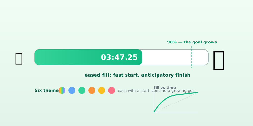
Pick a preset (1, 5, 10, or 15 minutes) or dial in a custom time, hit play, and the screen becomes one big filling visual. Themes set the mood — rainbow (seed to unicorn), ocean (droplet to whale), forest (sprout to tree), sunset (dawn to moon), hourglass (with falling sand), circle (target practice) — each pairing a start icon with a goal icon that waits at the end of the bar.
Then there’s the trick I’m proudest of: the goal grows. For the first 90% of the timer the goal icon sits at half size, and through the final 10% it scales up to full size — the whale gets bigger, the unicorn approaches, the tree matures. The visual cue shifts from “time is passing” to “it’s happening soon,” which is exactly the push a five-year-old (or their parent) needs to keep moving instead of wandering off. Cleaning up, getting shoes on, finishing dinner — the timer’s last stretch is an escalation, not a fade.
Time can be shown as passed, remaining, or both, in big monospaced digits with centisecond precision — and it can be hidden entirely, because sometimes the right cue is the bar alone. Pause and reset are one tap. Grown-up settings persist in the browser.
The technology
It’s React + TypeScript on Vite, with Tailwind for styling and the motion library for the growing-goal and falling-sand animations. The architecture keeps the discipline I’ve been refining across these projects:
- Domain layer holds the constants and rules: presets, tick interval (100 ms), the easing exponent, and the growth threshold/window — numbers-as-policy, not magic values scattered through components.
- Application layer is two hooks.
useTimerowns the state machine — start, pause, reset, and the tick loop — and exposes derived values, not internals:progress,goalScale,isFinished. - Presentation layer maps themes to icon/color sets and renders six visual variants of the same contract. A new theme is a data entry, not new logic.
Two details carry the experiment’s DNA:
- Easing mode fills the bar with a power curve — fast start, slowing finish, straight out of the fill comparison. But this time the exponent is dynamic: it scales with the total duration so a 15-minute timer feels as aggressive in its first seconds as a 1-minute one. The prototype used a fixed exponent; the product taught me the right constant for a 10-second bar is wrong for a 15-minute one.
- Anticipation is a separate channel from fill. The experiment had one dimension (displayed progress). The timer adds a second — the growing goal — deliberately keyed to the last 10%, when motivation matters most. A fill tells you where you are; a growing goal tells you what’s coming.
What it taught me
The experiment supplied the vocabulary — displayed progress, fill shape, perceived time — and the product forced the next question: attention to what end? A progress bar manages waiting. A timer for a child manages behavior, and behavior responds to anticipation. That’s why the finish line grows instead of just glowing.
It’s also quietly my most reused piece of software: a transitions referee, a clean-up motivator, and the reason “five more minutes” is now something we can all see.
Try it the next time someone small needs to do a thing right now: superdave2u.github.io/visual-timer.