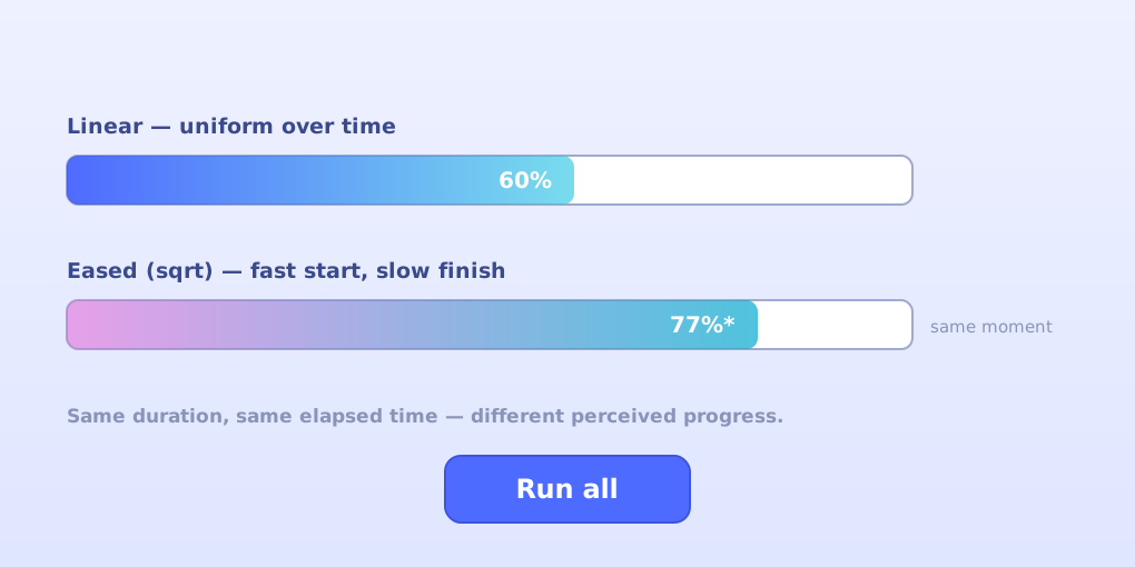
Managing Attention with Progress: Two Fills, One Bar
A progress bar is a promise. “Wait this long, and I’ll reward you.” But how that promise fills matters more than most designers realize: two bars can take exactly the same ten seconds and produce completely different experiences of waiting. That gap between actual time and perceived progress is what my Progress Bar Experiment explores. Source is on GitHub.
The experiment
The prototype renders a progress bar twice in sequence with two different fill methods:
- Linear fill — progress increases uniformly over time. 50% elapsed means 50% filled.
- Eased fill — progress applies a square root easing function, so the bar moves fast at the start and slows as it approaches the end. The same 50% elapsed moment shows roughly 71% filled.
Watch them back to back and the difference is visceral. The linear bar can feel stuck during its middle stretch; the eased bar buys goodwill early — you feel momentum immediately — but its slow crawl near 90% has its own personality problem. Neither is “better”; that’s the point of running the comparison instead of assuming.
There’s a second variable worth noticing: the label. The bar can show a percentage or the seconds remaining, and the label rides on the fill — so on an eased bar, the countdown slows down too. Perception isn’t just the shape of the fill; it’s what the number tells you while you watch it.
From prototype to platform
The first version worked, but it was a demo with the training wheels welded on: two bars hardcoded to run one after another, easing fixed to sqrt, duration fixed at 10 seconds, and geometry coupled to the canvas center — a page reload was the only restart button. As an experiment it could only answer one question, once.
So I rebuilt it as a platform for asking more:
- A registry of fill options. The easing is no longer hardcoded —
linear,easeOutSqrt(the original),easeOutCubic,easeInOutCubic, andeaseInQuadlive in anEASINGSregistry, each a pure function from raw progress to displayed progress. Adding a new fill option is one line. - Per-bar fill rates. Every bar gets its own duration input, so you can pit a fast linear bar against a slow eased one.
- Multiple bars side by side, one button. Add as many bar rows as you like, each with its own easing and rate, then hit a single Run all button — every bar starts simultaneously and stacks vertically on an auto-sized canvas.
- Parallel or sequential modes. Parallel runs the bars side by side (the cleanest A/B comparison); sequential preserves the original setup, one bar after another.
- Restart without reloading. The same button reruns the experiment endlessly, and completion is detected so the animation stops itself instead of pinning the CPU.
The refactoring behind that: bar geometry moved into per-bar layout (position, length, thickness) instead of canvas-center constants, easing became a strategy injected into the base ProgressBar class, and the label logic was made explicit — the percentage reflects the displayed fill (perceived progress), while remaining seconds derive from real elapsed time.
What it taught me
The original prototype’s lesson is about attention: progress perception is a lever, and easing is one of its cheapest settings. The rebuild’s lesson is about experiments themselves — a good experiment platform removes the friction between having a question and running the test. When “what does easeOutCubic do to a 30-second wait next to a 10-second linear bar?” is three clicks instead of a code change, you ask more questions.
Open the live demo, stack up a few fills, and watch how badly your sense of time can be lied to.